
Kate Just - Various Works

Kate Just - Protest Signs (2022)
This week I’ve been looking at Kate Just’s knitted text works. I deeply resonate with how direct the words are - they are short, sharp statements spelled out in bold typography, but then you realise they’re made through one of the slowest, most patient processes: knitting. The tension between speed of message and slowness of making is what makes them so powerful.
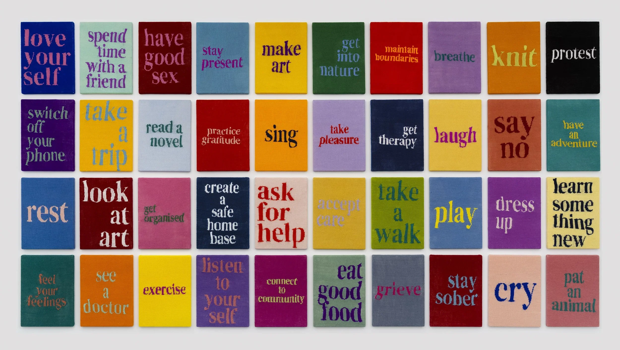
Kate Just - Self Care Action (2022-2023)
I like how this connects to communication design. Just’s pieces still read like posters or banners (direct and didactic) but they’re translated into a material with its own history. Knitting carries associations with care, domesticity, and the feminine, which gives her statements extra weight. It reminds me of what Rozsika Parker called the “subversive stitch”: the way textile practices dismissed as craft or women’s work can become political tools.
For my own practice, where I’m exploring beads, embroidery, and the hyper-feminine as strategies of expression, Just’s work feels like an anchor. She shows how material processes that are coded as “craft” or “feminine” can deliver uncompromisingly direct messages. There’s no apology in it.

Kate Just - Tickled Pink To Be A Woman (2023)
I also like that her work plays with contradiction, soft wool delivering hard truths, slow hands making urgent statements. It makes me think about how my own use of sparkles, fairytale references, and decorative detail can also act as typography in a way and perhaps serve as a clear, visual language that communicates beyond just surface prettiness. As someone who has a background in communication design I’ve often shied away from incorporating typography or obvious hallmarks of comm design in my art practice, however this is showing me there is a world where the two can coexist.
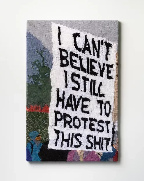
Kate Just - I Can’t Believe I Still Have to Protest this Shit (2021)